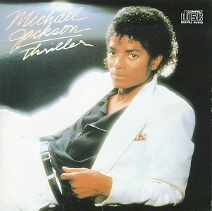
Also, the font used for the artist' name is usually bigger than the actual name of the album which I like aswell and will consider using for the CD/digipak cover. I really like the idea and image behind the Keyshia Cole CD/digipak front cover, as it represents a different side to her.
Sunday, 6 January 2013
Digipak Research
Also, the font used for the artist' name is usually bigger than the actual name of the album which I like aswell and will consider using for the CD/digipak cover. I really like the idea and image behind the Keyshia Cole CD/digipak front cover, as it represents a different side to her.
Labels:
Digipak
Subscribe to:
Post Comments (Atom)


No comments:
Post a Comment