Sunday, 28 April 2013


Evaluation 3
Through our treatment we managed to receive a lot of ideas and suggestions for our music video, this was also our first immediate time giving our to our audience and also receiving some feedback. We also managed to get feedback on the day of our showcase by filming our target audience and asking them some questions in depth.
Evaluation 2
How effective is the combination of your music video with your digipak and magazine advertisement?
When creating my digipak I aimed to create synergy between my digipak and the music video itself. I decided to use shots from my music on both my magazine advert and digipak as I wanted to create a similar theme between my digipak, magazine advert and music video so that my target audience could see the consistency between all three.
I chose to have pictures on my digipak of the artist at the start and the end of the on the front and the back of the digipak as it symbolises the link in the video of the character walking towards the audience at the start, and walking away at the end which I believe made it very effective in terms of the link between the digipak and music video.
I also decided to use quite plain, simple and boring locations for the inside of my digipak as this represents part of the character during the video, as she is alone throughout the video but she manages to overcome her heartbreak as the audience see at the end - the birds on inside of the digipak represent her freedom and the character coming back to herself. I also picked the songs to be on the characters back so it looked like it was credits a bit like on a film going up, similar to the character as she is walking away.


When creating my magazine advert I also aimed to create a link between the magazine advert and music video, however I didn't want to use the same pictures. I decided to pick a picture of Amy Winehouse as she is a famous icon which people would immediately associate with Camden. As Camden was one of our main locations we used to shoot our music video in, I knew our target audience will recognise her, also it fit with our genre - Hip-hop/electric pop/r&b.
I also decided to include a few songs on the magazine advert including our song 'Her Reflection' to get my target audience' attention but I also decided not to include too many songs so that it will leave them in suspense.

Friday, 26 April 2013
Media Showcase Event
Yesterday we presented our music video to family and friends at a media showcase event and we also managed to get some feedback which was great!
Thursday, 25 April 2013


Thursday, 18 April 2013
Tuesday, 26 March 2013
Update on our music video
We have made a cyclical link between the start and end of our video in terms of the split screen. This is just a brief idea as to whether or not it will remain this way.
Some out takes filmed for the blog.
We've practically finished our music video, however a few slight changes may occur.
Wednesday, 6 March 2013
Magazine Research
We have also started to look at magazine adverts in terms of magazines that suit our genre. Here are some....

We decided to look at artists such as Marina & the diamonds, and especially Devlin as his music suits in very well with our genre so it will be great to use his magazine advert for ideas.
Sunday, 24 February 2013


Friday, 15 February 2013
Progression So Far!
We are just talking about our progression so far in terms of our music video and where we are at. Enjoy!
Tuesday, 15 January 2013
Digipak
DIGIPAK
Digipaks typically consist of a gatefold (book-style) paperboard or card stock outer binding, with one or more plastic trays capable of holding a CD or DVD attached to the inside. The digipak is virtually shatterproof and allows great graphic display.
The number of panels could be 4 to 6, 8 or more.
Originally used for the album packaging of leading musicians, the digipak and digipak family are now priced reasonably enough to be used for any CD or DVD project. The digipak is an extremely versatile packaging. It can be made to accommodate a booklet either by placing in a die-cut slot or gluing onto one of the panels.
Dimensions (based on standard 4pp digipak): finished size of 139.5mm x 6mm x 125.5mm.
Usually digipaks have these features:
- Sticker/logo
- Track list
- Featured tracks
- Colours
- Forms of image
- Band members/ lead singer featured or artwork
Audience Research
AUDIENCE RESEARCH QUESTIONS
- What do you think of our ideas so far?
- Does our idea suit our genre?
- Do you have any other ideas we could use in our music video?
- What do you think of our target audience?
- Does our storyboard relate to our genre? How?


We also made a twitter account for our band to enable us to have contact with them, for promotions and for them to give use feedback in order to improve or change key elements of our music video. It is also a very, fast, useful and effective way to interactive with fans.
Tuesday, 8 January 2013
Band Brand


For our band brand we decided to come up with names by brainstorming and we put the names from the other words together to give us a name. This was the process for the name of the song and the production company.
Band Brand: City View
Production company: Mega Studios
Name of song: Her Reflection
Signifiers
Signifiers - Beyonce (Best Thing I Never Had)
- The colour white represents her innocence and purity, and the rose may also represent the love she once had for her lover.
- The clip in the video signifies a time in her past that she is now over.
- The crown the man is wearing could possibly suggest that at the time he thought he was the more powerful one - 'the king' in the relationship.
- The costume she is wearing at the beginning which is quite revealing, suggests that she wasn't complete in comparison to the end of the video where she is wearing a full wedding dress.
- The lifting up of the bridal veil represents a new person.
Sunday, 6 January 2013
Digipak Research

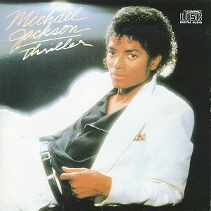
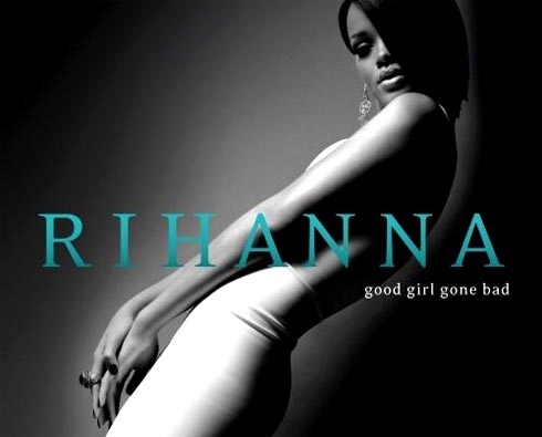


Also, the font used for the artist' name is usually bigger than the actual name of the album which I like aswell and will consider using for the CD/digipak cover. I really like the idea and image behind the Keyshia Cole CD/digipak front cover, as it represents a different side to her.
Subscribe to:
Posts (Atom)